
Math Progress
Designing a progress feature that shows students their growth in math skills


Role
-
Product Designer
-
UX Designer
-
UX Researcher
-
Visual Designer
TOOLS
-
Figma
-
Illustrator
-
Google Meet
-
Google Sheets
-
Google Slides
TIME FRAME
July - November 2022
SKILLS
User Research, Ideation, Information Architecture, Visual Design, Wire-framing, Prototyping, Testing, Iterations
Project Overview
This project was completed for an education company whose previous progress page was not efficiently communicating growth across math skills to students. Our team set out to design a new way to give students a holistic view of their areas of strength while also reminding them of potential growth areas.

WE AIMED TO
-
Balance the progress in the narrative of the game with the progression of the math content students were seeing
-
Provide a joyful experience that empower each student to be an active learner and doer of math.
-
Present a multidimensional picture of growth. This including highlighting areas of weaknesses without discouraging students
Previous progress page
CONSTRAINTS
Needed clear data visualization and goal setting for a broad age group (k-3)
Limited content and age appropriate research to inform design
Lack of screen real estate
Challenge
STAKEHOLDER GOALS
Our Product Manager and other stakeholders had three priorities:
-
Create a feature that can be built out in multiple phases , a beta version, an MVP version, and a final version
-
Create a feature that motivates students who are learning oriented, achievement oriented, socially motivated, performance oriented AND totally unmotivated while promoting intrinsic motivation. One thing was clear: we did not want to introduce an economy element.
-
Create a clear visualization that worked for all grade bands,
Our team was determined to leverage the game narrative and self determination theory to make student progress meaningful
Research
What are the skill stems for math?
I kicked off the project by teaming up with two learning specialists. I needed a view of what math progress looks like from grade to grade - and they suggested we started by looking at skill stems
How do kids learn math?
-
Math skills are not linear. Mastery of one math subject is not a prerequisite for learning another
-
Most math domains build in complexity from kindergarten onward. Kids begin acquiring math skills and learn to become progressively more fluent in those skills, adding on to things that they can do with existing knowledge around those skills

The content team put this math skill map together based on math curriculums
TRENDS AND MARKET RESEARCH
-
Q: How are students reflecting on their progress? Many programs use dashboards with graphs, trophies, coins, etc. Awards and economies are commonly used.
-
Q: What types of progress is being highlighted? Most programs reward lesson or skill completion. Others highlight accuracy and time spent in the program.
-
Many programs have a goal that students are working towards, whether thats minutes needed to meet a goal, amount of times a program is opened, number of questions answered, rewards earned or the number of units that are completed.
Stakeholder Feedback
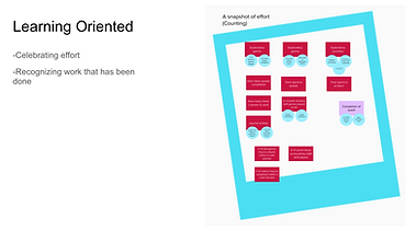
The initial research that was done by our research teams gave me a lot of insights, but I needed to know what our core principles were. The world we were building did not mesh well with rewards seen in other games. I got together with our director and did some brainstorming. We decided that we wanted a progress screen that sparks intrinsic motivation and doesn't discriminate between students. We didn't think it would be fair to reward students on log in streaks or time spent in the program, but instead wanted to find a way to reward effort.
Team Brainstorm
We held a large brainstorming session, where we created artifacts that combined knowledge and questions about progress. We knew it was too early to start brainstorming for solutions, so we collectively came up with general progress ideas and poked holes in them.


EMPATHY MAPS
Next, I wrote out different thoughts students might have about their progress. Some of the question the “after” scenario, where Diligr is utilized by the user This was a broad net that encompassed progression in narrative, in performance, and in learning. After that I tried to separate them into different motivation types and look out for any connections.


Concept Design
Sticker Book
Island Map
Goal Setting
Journaling
Please note that this design phase was very short - these are VERY low fidelity
Concept 1:


-
Sticker Book: This concept came about because it worked well in our world. We have a notebook as a main hub, and collecting stickers doesn't feel as incentivizing as collecting coins or trophies. We could include diverse stickers to touch on different motivation types and highlight that skills and effort are both equally valuable
Concept 2:
-
Island: This concept was interesting because many of our team members liked the idea of unlocking new math skills the way you would unlock new lands on a map. It felt like an organic way to show movement and it could be built upon. Unlike the sticker book, we didn't necessarily need to know what placement or measurements were needed. We could just start on an empty island and build upon it.

.png)

Concept 3:
-
Goal Setting: This concept was a more traditional way of displaying progress. We thought this would be similar to what students are used to seeing in classrooms, so there would be less of a learning curve. This concept also gives students a sense of autonomy over their learning.


Concept 4:
-
Journaling: Similar to the sticker book concept, this design also fit really well into our game world and was easy to scale. We didn't know what math skill adaptivity looked like - but we knew what our quests consisted of and what they were teaching.
.png)

Design Shareout
Our Users
We called our users "informed risk takers." They're looking for startups that are disruptive and impactful. The informed risk takers that work at larger funds are somewhat passive in their sourcing, while the informed risk takers at smaller funds really go out of their way to find potential investments.
Looking for: Companies that will enrich their communities
Values: knowledge and connections
Looking for: Companies that have impact
Stakeholder Feedback
These four rough concepts were shared with stakeholders. As a team, we decided to continue fleshing out the journaling, island, and sticker book concepts.

Journaling: As a team, we felt that this concept was a strong contender because it grounded progress through our narrative, and we could scale this design up as quests were developed


Island & Stickers: Overall, our stakeholders were split between these two designs. They felt that both had the potential to promote a learning oriented motivation, but they needed to be further fleshed out to see if they could be scaled up with our limited knowledge of content and adaptivity.
Goal Setting: Our stakeholders understood that we did not have enough information to provide a goal based progress page. We also struggled to find wording that encouraged students for this concept, so we decided to stop exploration on it.
The Problem
We had an extremely limited picture of what progress looked like in our game. We only had a few skill games built out and we didn't know what adaptivity would look like - so we had to build something that didn't go into skill specific progress YET, but could be scaled up to do so in the future.
Iterations
I spent the next few weeks fleshing out these three concepts, sharing them out, and iterating them. I worked with a narrative team and a content team to mock up possible growth milestones and badges.
Sticker Book

Iteration 1: Experimenting with modals, math domains, and objectives

Iterations 2-4: Experimenting with different notebook layouts, different progress milestones, and different progress visibility (ex: one version shows game icons depending on skill)

Iteration 5: Experimenting with different visuals - making the stickers more "sticker like"
Map Design
I went back and forth on this idea quite a bit - I regularly checked in with our creative director to make sure this concept fit in with the aesthetic of our game (flat visuals vs 3d map)

Iteration 1 : Exploring progress through time - students can flip back and forth through months to see their island expand

Iterations 2-5 : Exploring different visuals, different progress markers, and incorporating some of the sticker book concepts here: passport stamps


Iteration 6-8 : Playing with different topography visuals - building up would give us space to scale up as we learn more about adaptivity and content progression
Journaling


Iterations 1-5 : This concept went through 5 iterations, but we decided to focus on the map and the sticker book concepts earlier on - since this focused more on game progression than skill progress.
USER INTERVIEWS
We interviewed 5 venture capital investors from Australia
Stakeholder Feedback
After sharing these design iterations to multiple stakeholders, we decided that none of these concepts were scalable enough given our current understanding of progress. I went back to the drawing board with our creative director and looked at simpler ways to present progress for our Field Trial
Insights
Previous Designs:

-
One option was to recycle the progress reporting that another game uses, and adapting it to fit math skills
-
Pros: We already had the logic for these designs
-
Cons:
-
This design did not test well with any age groups
-
Students, parents and teachers did not understand this reporting
-
Mascot
-
Another option was to utilize our math companion in the game
-
Pros: Students already tied progress in with their character
-
Cons: We did not know how this would tie in with math skills
Defining
DESIGN DECISIONS:
Our creative director decided to utilize our game mascot in our progress screen. She gave me this direction and asked me to expand on it.
New design direction:

The new direction (mocked up by our creative director) emphasized skill progression through change. It no longer hit progress milestones but instead fluctuated as we reported out what a student was seeing
One of the original design asks was that we showcase where students are practicing these skills. I added a space to display the skill game icons that these math skills correspond to.
My initial mockups:


However, the more I expanded on this design, the more questions we had. For example, does it make sense that we're reporting skills relative to each other? Also - how does the backend work? Where do "fractions" start and end? Do we leave blank spaces for the skills that haven't been seen?
Iteration Part 2
Curioso DNA
We centered our progress view around our math companion with this idea that his math DNA was growing with the help of the student
First Iteration:


-
This version had equal space for each math domain, but highlighted differences within that domain (ex: The area domain might have 2 separate corals for adding and subtracting area)
-
Con: This would change quite a bit as we scale up - and could be disappointing for kids to see their progress diminish as more skills are added
-
This version measured the skills relative to each other, but didn't offer a lot of information regarding progress within each math domain. This means a student could go months without seeing a difference (for example - much of third grade is fractions - they would be stuck on fractions for half of the year and see no growth elsewhere)
Changes:
We decided to report the skills relative to each other and use the right page of the notebook to go into more detail. These were some of the low fidelity mock ups I created for the more detailed view

While our stakeholders deliberated on what the detailed view would consist of - I worked on the left side of the page. I noticed that these long buttons weren't ideal for kid use. Although they made up for their height by being longer, I wasn't comfortable making the clickable area so short. I went on to explore more accessible buttons

Second, Third, Fourth, Fifth, Sixth Iteration:

.png)
-
These designs have more accessible click zones
-
I noticed that the stakeholders loved the circular visual and wondered if we could expand that visual to be the click zone. I knew we had some time before we could start user testing so I began playing with less traditional buttons
Last Iterations:

Final Design:
-
I was inspired by the game Simon says. Although it's not as popular today, I thought some kids would recognize the structure.


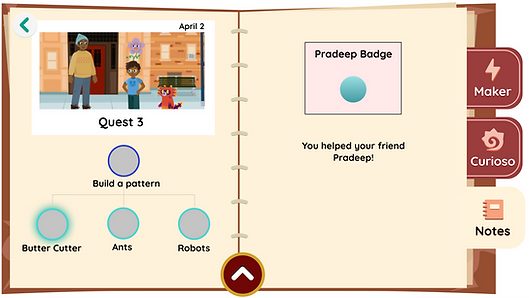
Skill Specifics : This page would include the games we know are already built out, and would simply report what levels were completed
Testing
Our UX research team agreed to conduct some usability tests based off of my testing plan. We combined my progress page testing with testing another game in between
Testing Goals:
-
Test the legibility of this donut design
-
Learn if students connect the changes in this page with the games they are playing
-
Observe how students interact with the graphs and buttons - Ask what feedback they expect from each button
-
Understand if students understand the "DNA" concept
Research Questions:
-
Do students understand that the percentages change according to how much time they spent practicing a skill?
-
Are students excited when they see new colors added to the wheel? Do they notice it? What do they think it's tied to?
-
Are students able to read the wheel and connect it to percentages? How do younger students process this?
-
Are the buttons "juicy" enough?
-
How do students interpret the graphs on the right page?
We tested this design by asking students to interact with the progress page (before they played anything, so every skill was at 0%,) play one level of two separate games, and then check the updated progress page.

Testing Sheet : This was the google sheets doc I gave the research team
Findings
-
Overall, all of the kids we tested understood the concept of "Curioso DNA." They understood that the math skills were combined to make Curioso.
-
All students correctly clicked on the buttons on the left page. When asked, most of them said they looked like buttons.
-
50% of kids thought that clicking on the game icons on the right page would take them to the game. 20% thought that clicking on the game icon would teach them about the subjects.
-
All students had different responses when asked what the graphs on the right page represent. Some of them thought it was the amount of levels they played, others thought it was the amount of times they played the game, others thought it represented how they performed in the game.
-
40% of kids stated that they expected more "stickers" on the pages.
-
Most students agreed that this information was valuable because they can "see how much I have completed." Another stated "This page is very helpful so you can keep track of how much you have been doing."
-
Overall, students did well with the left side of the screen and understood how to use it. They had different expectations and were confused about the graphs on the right side of the page.
Refinement
Since the left side of the page tested well with kids, I focused on updating the right side of the page. After a two design share outs with a senior designer, this is the final design I made:

Game Icons : These were made flatter, and a banner with the game name was added to make it look less clickable
Notification : I replaced the graphs with a simple notification alerting students the amount of times they've played a game
Background Color : Changing the background color for each math domain tied this page in a bit better with the left side of the screen
Documentation & Implementation
I worked with one developer to figure out the logic needed for this design. I created a Figma document with design specifics, along with all the needed assets and handed it off to the development team.


OUTCOMES
Full Progress Page
This progress page was implemented and is in the current build of the game. It was used in our field trial and tested well. The game is not out to the public yet.
NEXT STEPS
GIVEN MORE TIME,
Given more time, I would have liked to conduct more usability testing on the right side of the page and see if students still think they can click on the game icons. I would also probably want to further test other ideas we had, like the sticker book idea because kids mentioned stickers during our user tests. There isn't enough research on badges and motivation for younger children so I'd like to learn more about that.
IN RETROSPECT,
I wish we had more content to work with so we could truly map out what progress looks like for different kids. At the moment, the design feels a little superficial because we're reporting out what games students are playing, but we aren't encompassing their full math journey. The full game has many chances to grow as a math doer - not just the practice games. I would like to go back in a few months when we have a better picture of adaptivity and really bring all of the robust features into to the progress page.
If I had to redo this project, I think I would try to be a squeakier wheel and really push for a better understanding of what progress milestones we want to report out. I'd also like to do some research on goal setting and what that looks like for older children.


