
Diligr
Connecting venture capital investors to quality startups through a two sided marketplace

ROLE
UX Researcher
UX Designer
TOOLS
-
Miro
-
Figma
-
Google Forms
-
Zoom
TIME FRAME
September-November 2020
SKILLS
User Research, Workshop Facilitation, Research Planning, Interviewing, Personas, Ideation, Information Architecture, Sketching, Wireframing, Prototyping, Testing
DILIGR AIMED TO
-
Streamline the screening process for investors
-
Facilitate document and information sharing between investors and the companies they're matched with
-
Provide investors the ability to monitor and manage their potential deals

CHALLENGE
How might we combine a startup marketplace with a workflow management tool to help venture capitalists find their next investment opportunity?
Our stakeholder, Elizabeth, had two priorities:
-
A matching feature, where investors could browse through the startups they were matched with
-
A work management tool, where startup founders and investors could share document
Her main success metric was to accumulate returning visitors
OBJECTIVES
-
Matchbook: Design a professional interface that keeps users engaged while displaying all the necessary information?
-
Workflow: Help users visualize and monitor their potential deals?
-
Create an engaging MVP that provides value beyond investment opportunities and keeps investors logging in each day
RESEARCH
UNDERSTANDING THE VENTURE CAPITAL ECOSYSTEM
In our team, I was the most far removed from the investment world. I had absolutely no knowledge nor contact with anyone who worked in banking, economics or investments. We agreed that I would kick off the project by doing some exploratory research, in which I gathered all the information available on venture capital investing. Starting from the basics, these were the most important bits I uncovered:
VENTURE CAPITAL CRASH COURSE
-
Entrepreneurs turn to venture capitalists for funding because it’s difficult to get loans for early stages of a business. Venture capitalists require a portion of ownership (equity) in exchange for funding
-
VC investors focus on specific stages a startup is in, usually at the very beginning
-
Other things VC investors focus on are management teams, market opportunities, key metrics and financials, pitch decks, risks and expected valuation. (These criterias were validated in later research)
TRENDS AND FUTURE PREDICTIONS:
-
VC Funds are beginning to use AI to help with sourcing, evaluation, analyzing market data, and risking assessments
-
Larger funds build their own software to keep a competitive advantage over other funds
-
The traditional process of investing leaves a lot of space for unconscious bias. Now that funds are moving towards more data driven strategies, companies that are led by women and people of color are being funded more often because they’re being judged on company value instead of presentations
-
Experts predict that travel restrictions will cause delays in deal closures and could cause VC firms to focus on domestic companies
GAMIFICATION:
-
There is an increasing number of apps which gamify investment education such as Robinhood
-
Gamification doesn’t necessarily mean we’re making the app more fun, it’s also an opportunity to assist investors in making better decisions or encourage them to look into new sectors, or be more transparent with startups
COMPETITORS
A competitive analysis was naturally the next step to see what type of technology and systems venture capital firms utilized. Getting insight on our competitors was difficult, because most of them required credentials to sign up. The companies that we could not access were judged by piecing together their value proposition, video tutorials, and any other glimpses of the platform we could get.

Opportunities:
None of our competitors are fully successful at what Diligr proposes, which is integrating a matching platform and a workflow tracker.
-
Make both the matchbook and the task management tool flow into each other
Most platforms are focused either on firms that stick to a rigid strategy or firms that are willing to let them create a strategy for them.
-
Make onboarding customizable for both audiences, so firms can keep their competitive edge with their strategies while others rely more on data to guide and shape their process
-
During onboarding prioritize metrics investors look out for
-
Allow users to rank deciding factors such as founder, business plan, etc. and display those factors on their matchbook
WORKSHOPPING A USER OUTLINE
From the limited information we could find, it was evident that the participants we would be interviewing were busy people. We wanted to make sure our time with them was fruitful, which meant we needed a meticulous set of interview questions.
We decided to hold a workshop with our stakeholder, Elizabeth. She’s been working with venture capital funds for a long time, and could give us her perspective of what they do, how they do it, and the challenges they face. I began the workshop by facilitating an empathy map activity.
EMPATHY MAP

This allowed us to view the presumed “before” scenario, where users source and monitor startups without Diligr.
PRESUMED USER JOURNEY
Next, I facilitated a journey mapping activity, where our stakeholder and the rest of my team created a visualization of the “after” scenario, where Diligr is utilized by the user.
*It’s important to note that this is not the journey map we would be using to empathize with our users. It was made to shape our interview questions, create a vague mental model of our users day to day, and to highlight the discrepancies or similarities between user needs and what Diligr offers.

REGARDING USERS:
-
VC investors are competitive and always looking for the next opportunity
-
VC investors have a very specific criteria that they stick to while sourcing
-
There is some research collaboration with colleagues within venture capital funds
-
VC investors are constantly doing research on various startups and markets
FRUSTRATIONS:
-
VC investors don’t want to look through long-winded pitch decks
-
VC investors get frustrated by all the information they have to collect then later put together across multiple platforms
-
VC investors are worried that they’ll miss out on deals if they don’t do their research quickly enough
-
Investors get nervous to pitch their findings to colleagues and higher ups within their fund.
WANTS:
-
VC investors want pitch decks to be succinct
-
VC investors want a streamlined way to examine and document the company and its founders
-
VC investors want to speed up the research and sharing process
SETTING UP A HYPOTHESIS
Our research combined with our workshop artifacts provided us with some elementary assumptions that needed to be validated by our user interviews.
USER INTERVIEWS
We interviewed 5 venture capital investors from Australia
5 venture capital investors
In Australia
via Zoom
MAIN FINDINGS:
-
Investors generally don’t struggle to find new companies. In fact, all of the investors we interviewed begin their day by going through an inbox full of pitch decks. The consensus is that most startups aren’t of “good quality,” and investors don’t want to spend valuable time reading through those pitch decks
-
Some investors go out of their way to look for startups via incubators, the founders, or events
-
While investors usually have a very rigid and strategic criteria that startups have to meet, they’re even further constrained by the mandates of their firm. This means that the selection process wildly varies from one investor to another
-
Most investors think having confidence in the founder/founding team is the most important factor when deciding on an investment
-
Investors conduct due diligence on a company once they decide they’re interested. This is usually a process that varies based on the type of company that’s being looked at, and usually done between more than one person
REVISITING OUR HYPOTHESIS:
Our users

Their frustrations
Their frustrations

Their wants

DEFINING
OUR USERS
We called our users "informed risk takers." They're looking for startups that are disruptive and impactful. The informed risk takers that work at larger funds are somewhat passive in their sourcing, while the informed risk takers at smaller funds really go out of their way to find potential investments.

THE PROBLEM
The informed risk taker seeks to discover promising companies in order to make a calculated guess on what their team should pour their efforts into researching.
THE JOURNEY
Our customer journey begins at onboarding and ends with the customer finding the contact information of a startup. In between, they look at one startup, review it, and share it with their team.

During usability testing we found that this order of events would have to be reimagined.
BRAINSTORMING
We knew the focus of the project was on the matchbook and workflow feature. Our team decided to create 3 separate divergent concepts of what they might look like. I’ll be mostly speaking about my individual brainstorming process, which we called concept B.
MY CONCEPT
-
My matchbook concept featured a card style matchbook, where users could instantly “like” or “pass” on a company
-
Since one of the goals of Diligr is to increase transparency and accountability, I added in a reward system in the form of badges. Users can give startups badges based on what they’ve done well, which will catch the eye of other investors. The badge system is also a way to let the startup know that an investor viewed their profile and decided to pass on them
-
My workflow concept included a team dashboard where users can see all the companies they’ve saved from their matchbook. Each company has its own folder, where notes can be added or uploaded
-
My workflow concept also offers a voting feature, to reduce the back and forth while doing research

MY TEAMMATES CONCEPTS
-
Concept A focused on connections between investors, similar to Linkedin
-
Concept C focused on a clean matchbook that was straight to the point

TESTING
Paper Prototypes
6 venture capital investors
In Australia
via Google Forms
Our plan was to test these key screens with our users via Zoom. Unfortunately, we hit a roadblock while scheduling interviews with our sourced participants . As a team, we attempted to find new participants by targeting different venture capital groups on various social media platforms. Still, we failed in getting enough participants to interview. In order to stay within our timeframe we created a desirability survey to get feedback on our different concepts.
FINDINGS

MATCHBOOK:
-
Most participants preferred an interactive matchbook (Concept B) over a traditional, streamlined matchbook (Concept C)
-
Participants enjoyed that badge system and felt that they would make sorting through companies easier
-
Participants voiced that a summarized pitch deck within the initial introduction to a company was highly desired
WORKFLOW
-
Most Participants said they would utilize the voting aspect within the workflow. However, they thought voting should be anonymous
-
Participants were not fans of a social component on the platform (Concept A)
-
Participants enjoyed the team collaboration aspect (Concept A & B) and liked that these concepts had designated sections for storing notes
-
One participant expressed that they enjoy the ability to export files so they’re not entirely reliable on Diligr for records
WIREFRAMES
Mid-fidelity
DESIGN DECISIONS:
Keeping the survey results in mind, our team drafted wireframes combining the concepts that scored the highest.
MATCHBOOK:

Our converged design included the card style matchbook which allowed users to scan their matches and rule out the ones that weren't compatible.

The full factsheet was a combination of concept A and concept B.
Our workflow comprised of a shared dashboard where users can view the startups their colleagues want feedback on. Most importantly, it incorporated a voting and note sharing component to increase collaboration within the platform.


WORKFLOW:
USABILITY TESTING
3 venture capital investors
In Australia
via Zoom
GOALS
We centered our usability tests around four tasks:
-
Browsing matches
-
Searching for contact information
-
Utilizing the workflow feature
-
Voting on a company

RESULTS
MATCHBOOK:

-
All participants were able to complete the matchbook task without any errors
-
67% of participants wanted to see more information when they viewed the matchbook
-
All participants appreciated the pitch deck summary feature. All participants cited it as one of the most important features of the company factsheet
Iteration:
A short summary was added to give investors more information about the company as they triage their matches
VOTING:

-
All participants stated that they would utilize the voting feature to decide what companies to discuss during in person meetings
-
67% of participants were able to fully complete our voting task without error
-
All participants valued anonymous voting
Iteration:
-
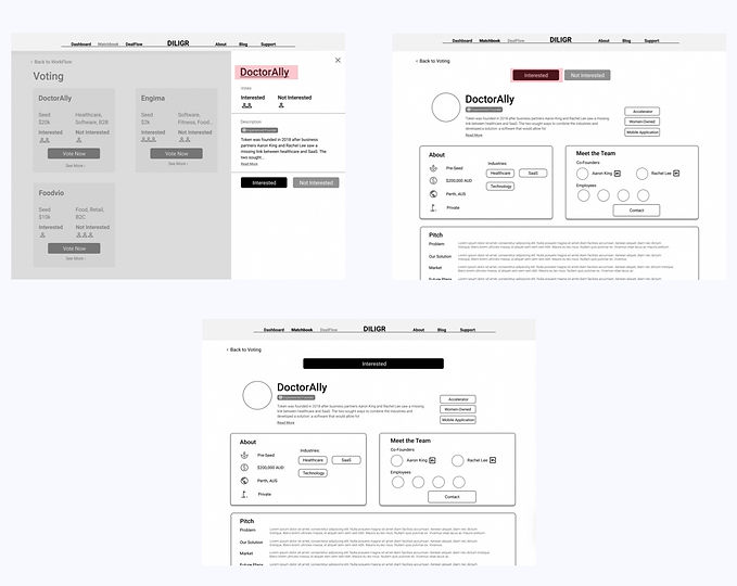
The full company page was linked for users who wanted more information before voting
-
The voting option was added on the full company page so users didn't need to go back and forth to cast their vote
CONTACT:


Iteration:
-
We made some changes in the hierarchy of the contact cards
-
All participants were able to find the contact details of a company
-
Participants stated that they would be confused on who to contact
WORKFLOW:
Our the road to our workflow feature wasn't usable. Once users got to the team folder they reacted well to the feature, but they didn't use it the way we intended

-
Only one participant was able to save a company to their workflow, successfully sharing it with the rest of their fund
-
The majority of participants couldn't access the workflow and didn't understand it's purpose
-
There was concern with "sharing" a brand new company that hasn't been researched with the rest of their fund. Participants felt that it was too early in the process to share
-
67% of participants already have a note taking tool and didn't see the point of keeping notes within the platform

What went wrong:
-
Our user flow mimicked the decision making process that was used while looking through pitch decks sent via email, but it didn't improve that process
-
The user journey we created early in the research process missed one critical aspect of user behavior that could be enhanced: "triaging"
-
Our design didn't allow users to visibly move a company through their decision process
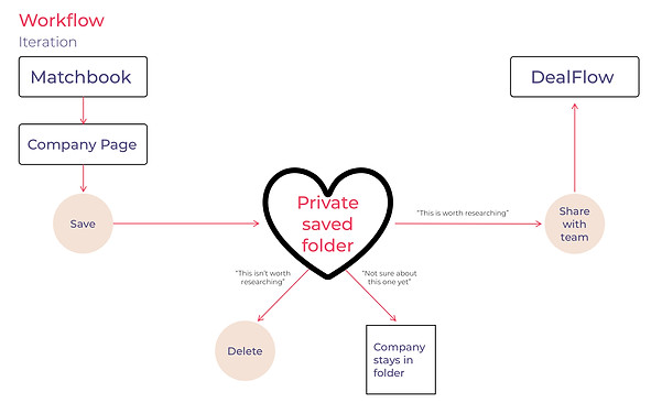
The user flow and the architecture of the website had to be redone. Having two paths was too complicated and wasn't intuitive for our users
Iteration:
-
We decided that a "saved" folder visible only to the user would be the heart of their decision making journey
-
The saved folder would be a catch all for anything that catches the users interest. Later on, they could move the most promising contenders from their private folder to a shared folder
All of our participants didn't really understand what "Workflow" meant. We changed the name to "DealFlow," because it's essentially something that keeps track of their potential deals

LACK OF CLOSURE:
-
Our participants felt a bit unsatisfied, or unsure of what they were supposed to do after they found contact information. They had a "now what?" feeling
-
One participant stated that he would like to graduate the companies he's saved. He was unsure of what he'd do with the companies that didn't end in deals, but he knew that he wanted to see the companies progress through his folder
Iteration:
-
We knew that our stakeholder intended the last step of the user journey to be finding a contact card, but simply finding that contact wasn't satisfying. We needed something else that was provide feedback and closure to our users
-
We weren't able to validate our badge system during our usability test, but we thought badges could be utilized as a way to get feedback and let the system know if they're moving forward with the company or not

OUTCOMES
Take a look at Diligr
Diligr is currently developing the startup side of the platform and will begin developing the investor side with the help of our research
NEXT STEPS
GIVEN MORE TIME,
Given more time, I would have liked to conduct more usability testing on the badges and the note taking features. I would have also liked to
-
Test a matchbook that has more matches on a page. We added more information about the matches-but is that enough? Would users who “triage” their matches need more cards on the page at once?
-
Test out a “graveyard” for past matches. An option might be to add a tab in the saved folder where users can track rejected startups
IN RETROSPECT,
I wish we focused more on the “end” of Diligr. Our stakeholder didn’t want Diligr to be a messaging platform, which made the wrap up of closed deals blurry. There was no way to know where a fund was in the research process with a company, and participants stated that they were thinking, “now what?” once they successfully found contact info for a startup they were interested in.
For example, when you log into your email, you go in with the goal of reading all the new messages, replying to the relevant ones, and satisfaction comes from clearing your inbox. Diligr had no moment of satisfaction. We expected investors to have that moment of satisfaction when they shared a good find with their team, but since there was always more to sort through, that moment never came. Not having the ability to see progress made the experience underwhelming for them.
We included a feedback form under the company page, which would give Diligr data points that enhance matches, and could give both startups and investors an indicator of where they stand on the chances of that deal being closed, but it doesn’t fully provide a moment of satisfaction.
If I had to redo this project I would focus less on the matchbook and workflow as separate pieces that needed to be linked. Instead, I would want to create a more linear user flow -where users can go back and forth between seeing what they’ve triaged, what they’ve disliked, and the contenders that they’ve found- and figure out where the matchbook and dealflow fit as pieces of that journey.


